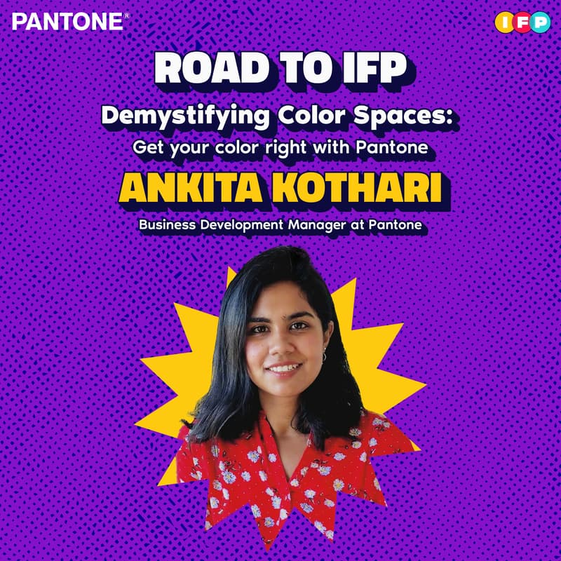
Demystifying Color Spaces: Get your color right with Pantone
Tired of colors looking different across platforms? Wondering why your screen-perfect pink looks meh on paper? Design in RGB, print in CMYK… confused yet? It’s not you - it’s your color space 🌈
Join Pantone for a workshop in color accuracy for creators who are done settling for ‘close enough’. Step into the color chaos as we decode RGB, CMYK, PMS and show you how and when to use the right Pantone system for flawless, consistent results.
🎉 Also get a chance to Win Exclusive Pantone Goodies!! 🎉
Learn how to avoid common color mistakes, work smarter with Pantone tools and Pantone Connect, and get it right the first time.
Whether you're designing graphics, merch, packaging, branding, or digital content, you’ll walk away knowing how to stop the guesswork and design with confidence - so your colors look right - from screen to print to product.
What to expect:
Why color spaces matter for a consistent visual identity.
How to choose the Right Pantone Standards.
LIVE walkthrough of Pantone Connect.
Solve common colo-related challenges
Tips to avoid production mishaps.
AMA - informal Q&A with a Pantone expert on your creative projects.